Most job applications are read twice. First by software that turns your file into fields — name, employer, dates, skills — and then by a person who skims the top of the first page looking for a reason to keep reading. Your resume format decides how both of those reads go, before a single sentence of experience is judged.
This guide covers the format that survives both readers: the standard section order, what belongs in each block, a copy-paste skeleton, how long the document should be, which file to send, and the layout choices that quietly break parsing.
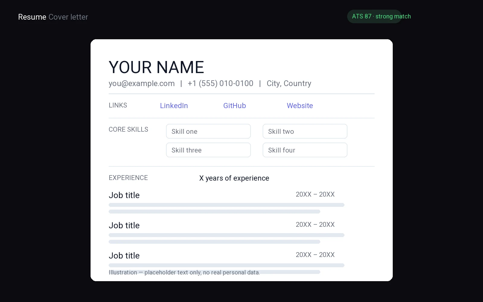
What a resume format has to do
A resume format is not decoration. It has three jobs, and a layout that fails any one of them costs you interviews even when the content is strong.
- Be read correctly by software. Applicant tracking systems convert your file into text and then into fields. Anything the parser cannot place — text inside an image, a phone number in a footer, a job title in a table cell — simply does not exist when your application is searched or scored.
- Be skimmable in seconds. A recruiter looking at a shortlist is not reading your resume, they are scanning it: current title, current employer, a few bullets, a reason to slow down. Structure is what makes that scan possible.
- Survive being forwarded. Your file gets opened on a different machine, printed to PDF again, or pasted into an internal system. Anything that depends on a specific font, a text box, or an exact page setup can break on the way.
The format that does all three is boring on purpose: one column, standard section names, real text, readable type. Save the design effort for the words.
The standard resume format, block by block
There is no universal template, but there is a conventional order that recruiters expect and parsers recognise. Deviating from it is possible; it just means the reader has to work harder to find what they want.
Contact details
Name, city and country, phone number with the country code, a professional email address, and a LinkedIn URL if you have one. Put all of it in the body of the document at the top, as plain text — not in the page header, not in an image, not as an icon next to an unlabelled number. A full street address is unnecessary for a job application and adds a detail that ages badly.
Professional summary
Two or three lines: the role you are applying for, the proof that you can do it, and the direction you want. This block does more work than its length suggests because it sits where both readers start. If yours currently reads like a personality description, replace it with a version built on the job title and the work you have actually done. If you want that block written out for a first job, a career change or a return after a break, our resume summary examples show the pattern.
Work experience
Reverse chronological, newest role first. For each role: job title, company, location, and dates as month and year. Then three to five bullets describing what you did and what changed because of it. Lead each bullet with a verb and end it with an outcome a stranger could understand — the system you fixed, the volume you handled, the team you coordinated, the problem that stopped recurring. Duties describe the job; outcomes describe you.
Skills
Eight to twelve items, grouped so they can be scanned: tools and software first, then methods, then languages. Use the exact names the employer uses — if the ad says "HubSpot" and your resume says "CRM platforms", the overlap is invisible to a keyword match. This is the block most worth editing per application.
Education
Degree, institution, and dates; newest first. Certifications, bootcamps and licences belong here too, especially when they are the clearest evidence for the role. Once you have a few years of experience, education moves below work experience and shrinks to two lines.
A copy-paste resume skeleton
Paste this into a plain document, replace the bracketed parts, and delete every line you do not need. Keep the order, keep it single-column, and keep the section names exactly as they are — those are the labels parsing software looks for.
[First Last]
[City, Country] | [Phone with country code] | [first.last@email.com]
[linkedin.com/in/yourname]

PROFESSIONAL SUMMARY
[Job title you are applying for] with [years/type of experience] in
[your field]. [One line of proof: the work you are known for.] Looking to
[the role you want next] at [type of company].

WORK EXPERIENCE

[Job Title] | [Company] | [City] | [Month Year] - [Month Year]
- [Verb] [what you did] so that [the outcome, in plain terms]
- [Verb] [system, tool or process you owned], [scope: team size, volume, region]
- [Verb] [problem you solved] and [what changed afterwards]

[Previous Job Title] | [Company] | [City] | [Month Year] - [Month Year]
- [Verb] [what you did] for [who it was for]
- [Verb] [result] by [how you did it]

SKILLS
Tools: [exact product names from the job ad]
Methods: [processes you can run without supervision]
Languages: [language - level]

EDUCATION
[Degree] | [Institution] | [Month Year] - [Month Year]
[Certification or licence] | [Issuer] | [Year]

[Optional: one line on a project, portfolio or publication, with a URL]
Two rules when you fill it in. First, every bullet answers "so what" — if it only lists a duty, it is not finished. Second, if you cannot fill a section honestly, remove it rather than padding it; an empty Skills block is less damaging than a list of things you would not want to be asked about.
One page or two?
One page is the default for anyone early in a career: students, recent graduates, career changers with a short relevant history, and anyone whose experience fits without shrinking the font. Two pages are fine when the second page is genuinely full of relevant work — a long professional history, several roles at the same level, publications, or a technical career with projects that matter.
What never works is a page and a half. The half-empty second page reads as poor editing, and it invites the reader to stop at the break. If you are close to the limit, cut in this order: the oldest role, then duties that repeat across roles, then interests, then the summary. Do not cut by reducing the font below a comfortable reading size or by pulling the margins in.
PDF, Word or Google Docs?
Send a PDF by default. The layout is fixed, it opens the same way everywhere, and a PDF exported from a text editor stays text — which is what parsing software needs. The failure mode to avoid is a PDF that is really an image: a scan, or an export that flattens text into pictures. If you can highlight a sentence in the file, the text is there.
Send .docx when you are asked to. Some application portals accept only Word documents, and some recruitment agencies reformat your CV into their own template. When that is the case, a clean single-column .docx will survive the process far better than a designed one.
Do not send an editable Google Docs link unless a person explicitly asks for one. Share a PDF export instead; a live link can change under the reader, and the sharing settings are one click away from exposing more than you intended.
Name the file predictably — firstname-lastname-resume.pdf — because that filename is often the only thing a recruiter sees in a downloads folder. Avoid "final", "v7" and dates in the name.
Formatting choices that break ATS parsing
None of these are style crimes. They are ways to make your details land in the wrong field, or disappear from the converted text entirely.
- Two-column layouts. The parser reads in document order, so a sidebar of skills can end up interleaved with your job history.
- Tables. Cells are often flattened unpredictably, and dates can detach from the roles they belong to.
- Text boxes and shapes. Content placed in a floating object is frequently skipped altogether.
- Headers and footers. Contact details placed there can be dropped by the converter — the section exists on the page and not in the text.
- Icons instead of words. A phone glyph beside a number tells a human what it is and a parser nothing.
- Non-standard section names. "Where I've worked" and "What I'm good at" read well and map to nothing; use Experience and Skills.
Images containing text, decorative fonts, and bullet points made from symbol characters belong on the same list. The common thread: if the information is not typed text in a conventional place, assume it may not be read.
Format mistakes that cost interviews
These are the ones that survive parsing and still lose the read.
- A wall of duties. Six bullets per role, none of them saying what changed. The reader has no way to rank you against the next candidate.
- Inconsistent dates. "Mar 2022 – Present" in one role and "2020-21" in the next makes a timeline look unreliable.
- A summary that names no role. "Motivated professional seeking growth" fits every application and therefore none.
- The same file for every job. No terms from the ad, no reordered bullets, no signal that you read it.
- Tight type. Small fonts and thin margins to squeeze in one more line cost more in readability than they gain in content.
- Contact details only at the bottom. If your name and email appear once, on page two, the document is harder to file and easier to lose.
Adapting the format to each job ad
The structure stays constant; the content moves. Read the ad once and mark three things: the exact job title, the tools and skills it repeats, and the outcome it says the role is responsible for. Then make one pass through your resume with those three lists in front of you.
Retitle the summary to the ad's job title where it is honest. Rewrite the first bullet of your most relevant role so it opens with the work the ad cares about most. Move the matching skills to the front of the list, using the employer's exact wording. If a requirement is genuinely missing, do not invent it — address the gap in the summary or the cover letter instead, because a fabricated line is the one thing an interview will expose. The mechanics of matching language are covered in how to tailor your CV to a job description, and the keyword side in finding keywords in a job description. Tailoring one resume is quick; doing it for every application is where searches stall, so it is worth building into a daily routine — our free job search action plan template sets one out.
If you want to know how the result is scored before you send it, how an ATS ranks your resume explains what the software actually compares. And if you are applying without much history to show, the format still holds — the examples in CV with no experience fit the same skeleton.
ATS-friendly fonts, margins, and layout rules
Automated tracking systems parse your resume by reading text from top to bottom and left to right. To ensure your data lands in the correct fields, you must structure your document with mechanical precision. Start by selecting a standard system font like Arial, Calibri, or Helvetica. These typefaces are universally recognized by parsing engines, ensuring that character recognition remains accurate without triggering errors caused by decorative serifs or complex ligatures. Avoid script fonts or custom web fonts entirely, as these often fail to render correctly in the backend processing layers.
Next, configure your page margins to exactly one inch on all sides. This uniform spacing creates a predictable boundary for the parser, preventing it from misinterpreting header information as body text or footer details as main content. Consistent margins also signal professionalism to human reviewers who may bypass the algorithm. Do not use narrow margins to squeeze in extra content, as this increases the risk of text being cut off during the conversion process from Word to PDF.
Finally, eliminate complex layout elements. Multi-column designs confuse linear parsers, causing them to read the right column before the left or merge separate sections into one garbled block. Tables, text boxes, and graphics serve the same destructive purpose. These visual containers hide text from the parser’s view, resulting in missing skills or contact details. Stick to a single-column, linear flow. Use simple horizontal lines or bold headers to separate sections instead of graphical dividers. Your goal is invisible structure. Let the content speak clearly while the format stays transparent to the machine.
- Choose standard sans-serif or serif fonts available on all operating systems.
- Set uniform one-inch margins to define clear content boundaries.
- Remove columns, tables, and images to maintain a linear reading path.
RESUME FORMAT FOR CAREER CHANGERS
Shifting to a new industry requires moving away from a standard chronological work history. Build your resume around transferable skills that tie your past roles to your target field.
A transition-focused resume uses these core components:
- Targeted Summary: Lead with a brief statement calling out specific skills from your prior background that directly align with your new career goal.
- Skill Clusters: Group functional competencies into thematic categories instead of listing duties tied to past job titles, so hiring managers can identify relevant expertise at a glance.
- Relevant Projects: Feature side work, certifications, or volunteer efforts that demonstrate hands-on ability in your target field, to close any perceived experience gaps.
- Recontextualized Experience: Frame past responsibilities to highlight universal achievements such as leadership, process improvement, or client management, instead of relying on industry-specific jargon.
Prioritizing your applicable skills over past job titles lets recruiters easily see your value for a role in a new industry.
How to format employment gaps on resumes
Employment gaps can occur for valid reasons, such as caregiving, education, or career transitions. Present them clearly to avoid misunderstandings. Use a dedicated section labeled "Employment Gaps" or "Career Breaks" at the end of your resume. Avoid burying this information in a generic "Additional Information" section.
- Be concise: Explain the gap in one or two sentences. Focus on the reason, not the duration. For example: "Completed a certification program in project management."
- Use action verbs: Frame the explanation as a positive achievement. For example: "Volunteered as a tutor for at-risk students."
- Keep it professional: Avoid vague terms like "personal reasons" or "family matters." Instead, highlight relevant skills or experiences gained during the gap.
- Proofread carefully: Ensure the explanation is error-free. Typos or unclear phrasing can create doubt about your intentions.
If the gap is short, you may omit the explanation entirely. For longer gaps, the section should be brief and directly related to your current role. The goal is to demonstrate that the break was intentional and beneficial, not to justify it.
**"Resume Format for Entry-Level Candidates"**
Your resume needs to pivot from listing duties to demonstrating capability. Since you lack extensive professional history, your structure must prioritize transferable skills and academic achievements. Start with a strong professional summary that frames your career goals and highlights your core competencies. This section acts as your elevator pitch, telling recruiters why you are a viable candidate despite limited tenure.
- Education First: Place your degree, GPA, and relevant coursework directly after the summary. This anchors your credibility and shows foundational knowledge in your field.
- Skills Over History: Create a dedicated skills section featuring technical proficiencies, languages, and soft skills. Use specific tools or methodologies to prove readiness for immediate contribution.
- Project-Based Experience: If you have internships, volunteer work, or significant class projects, list them under an "Experience" or "Projects" heading. Focus on outcomes rather than responsibilities. Describe how you solved problems, collaborated with teams, or delivered results.
- Quantify Achievements: Even in small roles, measure impact. Did you streamline a process? Increase engagement? Use concrete metrics to show tangible value.
Avoid generic statements about being a hard worker. Instead, show evidence of your potential through specific examples. Your resume should read as a portfolio of capabilities. Recruiters look for indicators of growth and adaptability. By organizing your document to highlight learning agility and practical application, you demonstrate that you are ready to tackle real-world challenges. Keep the layout clean and scannable. Use clear headings and bullet points to guide the reader’s eye. This approach transforms a short history into a compelling narrative of future potential.
Modern Resume Trends
AI-generated content is changing the way resumes are created, with tools that can draft tailored summaries, bullet points, and entire sections based on your input. To make the most of this technology, personalize the output to reflect your voice and experiences, avoiding generic phrasing that can be easily spotted.
Video resumes are becoming increasingly popular, particularly in creative and customer-facing roles, as they allow you to showcase your communication style, enthusiasm, and personality. When creating a video resume, keep it short and professional, with a focus on your key strengths, and ensure that the production quality is high, with strong lighting, clear audio, and a neutral background.
Resumes are shifting towards skills-based layouts, which group your abilities under relevant headings like "Technical Skills" or "Leadership." This format allows hiring managers to quickly see your relevance for the role. To make the most of this format, back each skill with evidence, such as a brief example or achievement, to demonstrate your expertise.
- Always revise AI-generated templates to fit your own voice and experiences.
- Approach video resumes as you would a professional interview, and prepare accordingly.
- Use skills-based sections to draw attention to your most relevant skills and qualifications.
**Resume Format for Remote Jobs**
Remote resumes must demonstrate autonomy and clear communication. Use a clean layout with distinct sections. Begin with a header containing your name, email, and portfolio or LinkedIn link. Use precise titles such as "Remote Software Developer" instead of vague headings.
Feature tools and skills critical for distributed teams:
- Soft skills: Emphasize autonomy, time management, and problem-solving using terms like "self-directed work" and "remote collaboration."
- Technical skills: Align your expertise directly with the job description, such as Figma or Adobe Suite proficiency for designers.
Keep the document brief since employers skim quickly. Write achievement-focused bullet points rather than passive duty lists. Quantify outcomes, such as "Managed five remote staff" or "Accelerated project delivery through new workflows," and avoid long paragraphs.
Proofread thoroughly to eliminate errors. Save the file as a PDF or Word document with a clear title like "YourName_RemoteResume."
Optimizing for Applicant Tracking Systems
Applicant tracking systems scan your resume before a human ever sees it. If your layout confuses these software parsers, your application gets filtered out immediately. Keep your structure clean, logical, and entirely free of design gimmicks.
- Stick to single-column layouts so parsing software reads your work history and skills in the correct chronological order.
- Use standard section headings like work experience, education, and skills instead of creative titles that automation tools fail to recognize.
- Save your file as a standard text-based format rather than an image-heavy PDF or proprietary file type that obscures raw text.
- Avoid tables, text boxes, headers, footers, and graphics because these visual elements frequently break parsing algorithms and scramble your content.
- Incorporate exact keywords from the target job description naturally throughout your descriptions to match the automated search criteria.
Once you satisfy the software constraints, your document remains easily readable for human hiring managers. Balance clean technical formatting with clear professional achievements to ensure success at every stage of the review pipeline.
FAQ: resume format
How long should a resume be for a first job application?
One page. At that stage there is rarely enough relevant material to justify a second page, and a full single page reads as focused rather than thin. If you are short of space, use the summary and skills blocks to show direction.
Should I put my photo on a resume?
It depends on where you are applying. In the US, UK, Canada and Ireland, a photo is usually omitted and can even be discouraged to avoid bias. In much of continental Europe, Latin America and Asia it is common or expected. Follow the local norm and the job ad; if the application is parsed, leave it out.
Do I need a different resume format for a CV?
Usually not. In the US, "CV" tends to mean an academic document with publications, which can run longer; in the UK and most of Europe, "CV" is simply the word for a resume. The single-column format works for both — only the length and the publications section change.
Where does the education section go if I graduated years ago?
Below your work experience. Education leads only when it is your strongest qualification: a recent graduate, a career change built on a new degree, or a role where a specific licence is required. Otherwise two lines at the end are enough.
Can I use the same resume format for every industry?
The format, yes; the content, no. A designer may need a portfolio link, a nurse a licences block, an engineer a projects section — all still single-column and text-based. What changes between industries is emphasis, not structure.
The bottom line
A job-application resume should be one column, standard sections, real text, and short enough that a stranger reaches the end. That format is not a compromise on quality; it is what lets the quality be seen, by the software that files you and the person who decides whether to call.
Get the structure right once, then spend your effort where it changes outcomes: the summary, the first bullet of your most relevant role, and the handful of terms you mirror from each job ad.
Check your format before you send it. Paste the job ad, add your CV, and get a tailored version with an ATS score.